feedback vs. collection site

Screen Shot 2014-04-11 at 1.13.05 PM

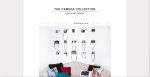
today we got together as a class and went through the progress on our collection sites, so I got the opportunity to get some feedback from all of my lovely design buddies. it went something like this:


MS: I really like your copy for stuff (i.e. with age comes wisdom)

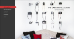
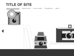
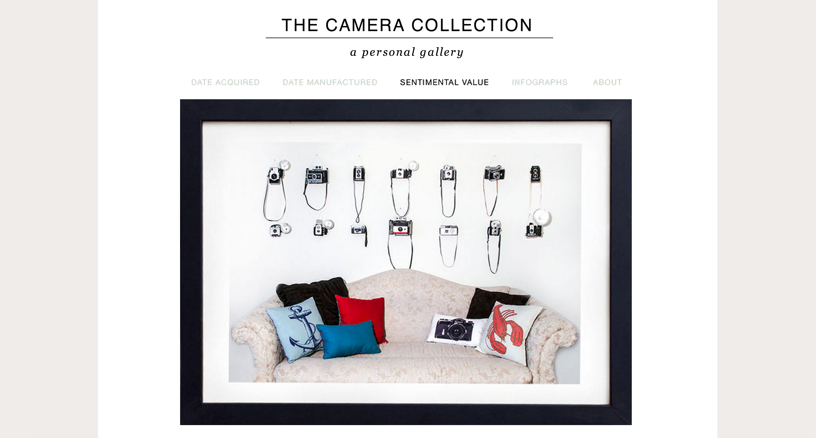
MR: Want you to paint your couch

BD: or paint your pillows

KB: With me sleeping on the couch

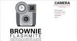
MR: It looks like your picture may be over exposed
I almost feel like you don’t need the couch

TC: I agree

BD: Take off bright pillows from couch

KB: Just make em’ black and white

DD: Take off lobster and anchor

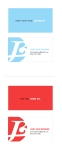
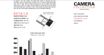
BD: This is the only page where there is prominent color


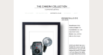
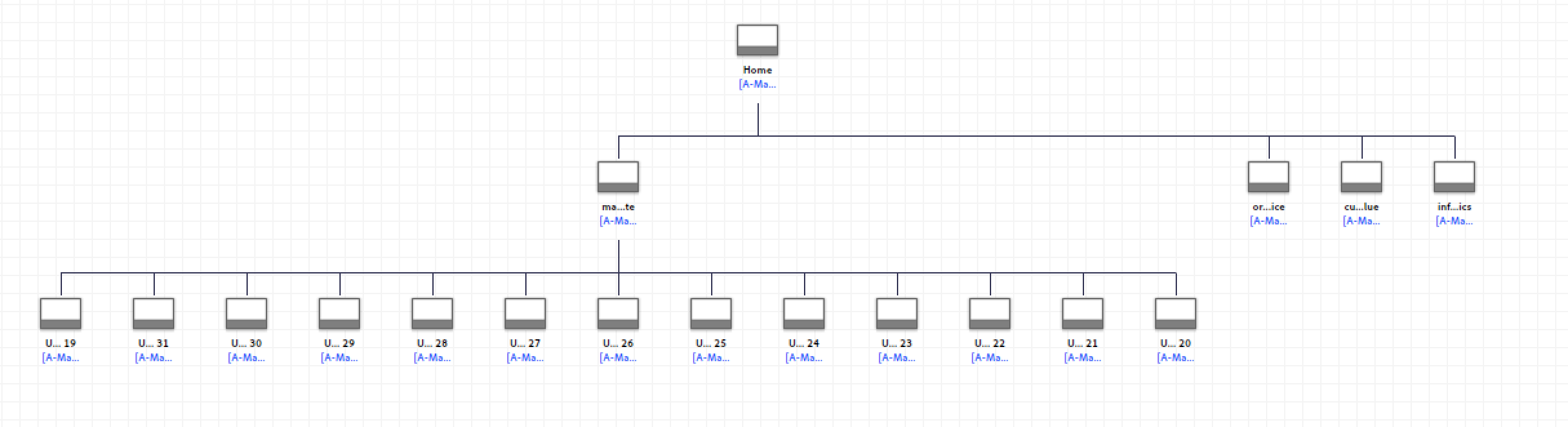
so there was a lot of debate about the couch…whether it added any depth to my concept or if it was just distracting from the cameras. but the majority of the class did agree on the vertical rectangle composition rather than the square format for the home page.

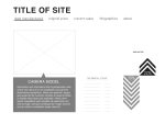
there was also mention of considering taking the red and the blue seen in the home page into the reveal pages for little accents of color.

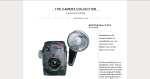
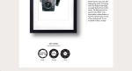
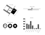
morgan also made a great point about adding some memory attached to the cameras on each reveal page along with all the technical information, to give more of the personal feel that i have going on.


print materials for printing

Design Iterations for Camera Collection Site


#the50 Things Every Creative Should Know

new ideas are always ‘stupid’

New ideas are conceived with no context and no measures of success – this falsely makes them feel silly, awkward or even impossible.#the50

that is just one of #the50 Things Every Creative Should Know. this was a great read, there was no beating around the bush; creative advice in 140 characters or less. I thought it was clever to write an article of design advice in the form of a group of tweets, being in this day and age, that format just seems to resonate. and i personally like, short and sweet statements, that you can remember, maybe even pull out of your pocket and quote every now and then. and the cute little illustrations were great too for visual people; remember what it looked like, and then remember what it said.

midterm self-assessment

I don’t feel like I have worked hard enough towards my potential and I still am unsure of what exactly I want to do with design when I graduate. that being said, I feel like I have found a renewed motivation to push myself and my design work. over the winter break and on into the first few weeks of this semester, I was questioning a lot of things about where I was and where I was going; soul-searching, you could say. during this period of assessment, my anxiety had a field day and I took on an outlook that was not helping me, but instead was comparable to a ‘pity party’. I realized that this attitude was in no way what-so-ever productive or constructive. so, upon this realization, I began an attitude makeover, I decided to change my perspective and – be. more. positive. a healthy dose of positivity in my life made a big difference. I already feel more confident to speak to people and about my work, and I’m more excited and motivated about my design work. and when I’m more positive, I’ve noticed that the people around me respond more positively as well which is just a great feeling all around. I am excited to continue to grow and to learn. One thing that I really struggle with for some reason, is keeping up with my blog posts. This is a silly thing to struggle with and I feel that it could easily be corrected. I write everything down in my journal, but I write EVERYTHING in my journal, so sometimes the more important notes to self get lost. I’m thinking of getting a calendar planner as well to keep up better with when to do what.

wireframes/sitemap vs. collection site

Screen Shot 2014-03-07 at 8.48.47 AM

infographics vs. collection site

I am using my antique cameras to fuel my collection site. here are some infographic sketches for stats pertaining to my collection:

Interview Questions Reading

This was an excellent read. Life is full of interviews, and you can never be too prepared. What I especially liked about this reading is that was that it acknowledged that every question has a trick to it, that even seemingly straightforward questions are testing you. And then, not only does it tell you what trick is underlying the innocent seeming question, but it tells you how you can react in the best possible way. And I’ve read other articles and snippets about interview questions, but something that I had never come across before that this article addresses, is the silent treatment; how to react to no question at all. I had never really thought of that, and if I had come across that in an interview out of the blue, I might very well have freaked out. not now.

fortune tellers vs. mood boards

who: fortune tellers or psychics are commonly gypsies and even if they aren’t, they still dress the part. fortune tellers love all the bangles and scarfs. rings, medallions, headpieces, their all about that. there are, of course, the more humble fortune tellers, but for the most part fortune tellers like to give a show with candles and crystal balls and sparkly things. and they always have the tools of their trade with them; tarot cards, crystals, tea.

Untitled-2-01

where: fortune tellers often have tents that travel with festivals or carnivals in the true traveling gypsy feel. the tents have a very intimate and magical feel, often small with dim lighting.  you can also find fortune tellers set up in small shops or out of someones home (often signified by bright neon signs). or if all else fails, you can just pick up your phone and give a fortune teller a ring.

Untitled-2-02

ideas: just some visuals relating to fortune tellers that  i found compelling for inspiration in this process.

Amarillo Globe News Final

My Amarillo Globe News website redesign.

Being a news site, it’s going to have a constant heavy flow of information, so I wanted to organize it in a way as to make it feel clean and light, easy to approach. I also wanted each user to be able to have a personalized experience. Hypothetically the site would track the user’s history and the home page would respond by showing articles in their areas of interest, and there is a side bar to do this manually also. Going along with the personalized experience, when the user gets into a specific article, they are presented with a ‘workspace’ where they can take personal notes that they can then save along with the article to go back to later.

below I have included layouts of certain pages, and a short animation that takes you through the site: