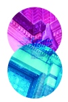
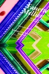
these are shots of my final bronte themed magazine spread. the whole tone of the design has strayed a bit from the feel of my initial branding elements (dark/romantic/errie)…and by ‘a bit’ I mean pretty much completely (past vs. modern/story/brooding playful)–but I can explain! when I was creating a layout, I started tailoring the tone of the design to the specific content of the found article. I almost reverted back to more of the style of my initial elements before they evolved into their darker counterparts, and in result, my branding elements will probably change in relation to this when I get back around to them. enjoy:
The Brewery
Where Ideas Are Brewed
Category Archives: Typography2
what is creativity?
here’s the answer. thank’s, einstein.
this is my motion piece that brings my window display to life. it’s not as long as it thinks it is. i’m going to fix that, i just haven’t quite figured out how yet. enjoy.
baby steps
here is my first exploration into kinetic type using grow, fade, move, rotation, and freestyle. enjoy:
window application
here are my previous designs modified to fit a certain window on the building. and now i’ve add color! and though the colors are overly bright right now and slightly hard to look at, i am still playing around with those.
seven principle compositions: reloaded
here are my reloaded and revised compositions displaying the seven principles: gradation, concentration, space, direction, anomaly, texture, and repetition. I tried to keep in mind not only the principle but also the composition on the page, and the quote we are trying to represent. I completely redid some of them and for others I revised and rearranged certain aspects.


