Category Archives: Human Centered Design

reading response

in the article, THE DESIGN CURRICULUM OF THE FUTURE MUST BE ANTICIPATORY AND AGILE, it poses the question “can we afford to continue offering design curricula that move from the simple to the complex, when contemporary design problems are all about relationships—a complicated web of interactions among people, settings, activities and technology?”.

though i realize the necessity of keeping up with the fast paced design problems and functions of today, i wouldn’t think it would be proper to skip over the ‘simple’.  the history of an art form informs the future of it. though design becomes more complex with the forward momentum of technology and society, you can’t ignore the past, dubbing it obsolete. i think it’s important to learn and experience the growth of all components of design to fully understand every piece of the puzzle that fits together in a design piece. and what about that thing where history repeats itself? we should be prepared for that direction as well.

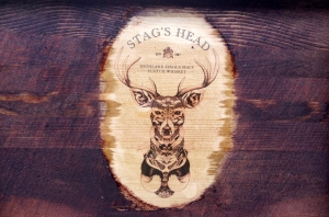
try. fail. try again. fail better.

my first test run with the wood staining was not a great victory, but i learned from my mistakes. I experimented with temporary tattoo paper that you can print your own designs on, to see if it would transfer onto wood instead of skin. and it worked! which i am very much excited about the possibilities that opens up for my little wooden box. but i didn’t take into account how resistant it would be to any staining after application…so i tried to sand it down around the edges so that it would form an oval rather than an obvious square. which kind of messed up the whole shabang. but that’s what test runs are for!

photo (4) copy

inspire

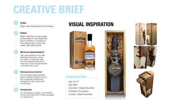
More creative inspiration and initial ideas for my single malt scotch. it’s coming along

Product Questionnaire

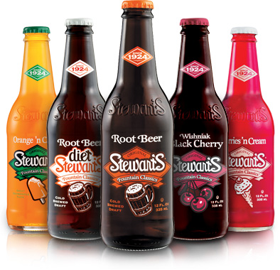
img-stewarts_022831908732

What’s the name of product?
Stewart’s Root Beer
Are you familiar with any background information on the product?
Stewarts opened it’s first root beer stand in 1924 and set out to develop the worlds best tasting root beer. Grew from a drink stand to a drive in to bottles sold in stores. It’s a classic.
What’s the objective assignment? (For example, the objective might be to re-introduce the product targeting a younger age group.)
Root beer seems old fashion compared to other soda beverages. I want to 
re-introduce the product as more modern and hip. I root beer to make a stylish entrance.
Who is the target audience?
sweet drink. mainly younger age range. not the health conscious. 
What is the product description?
Glass bottle with designed label and bottle cap, containing the sweet nectar root beer. contained in 
cardboard box with brand design.
What are the benefits of the product?
delicious beverage to clench your thirst or that incessant sugar craving. 
Is there support for these claims?
not scientific…
What elements (barcode, price tag, etc.) must appear on the package?
barcode, brandname
Has the material already been selected, or is it still open for suggestion?
open
What are the distribution considerations? (Is the product going to be shipped in dozens, 1/2 dozens, etc.)
a box would contain four to six bottles
What is the retail environment? (Is the product going to be displayed on peg board, shelves, point-of-purchase displays, etc.? Will it be available to the mass market or sold in a boutique shop, specialty store, etc.?)
shelves in the mass market
What is the USP (unique selling point)?
a classic beverage with a modern twist.

defining the designer of 2015 vs. competencies

in the articles, it talks about the expectations of designers in the not so far off future, 2015, the year that our class will be pushed out of the tree to see if we can fly in the design world. As I was reading, I couldn’t help but think that most of these points apply to professions beyond the scope of graphic design as well. That in this age of fast paced progress and instant information, the expectations of the next generation transitioning into the career world have changed with the times. We are surrounded with so much technology and access, but how are we utilizing it? The future is asking us to use our generations advancements to become more well rounded people with a broader understanding and quick ability to respond to what’s happening in the world around us outside of our specific skill sets. good luck.

batiste in motion

this is a first run at it. this is progress. it all gets better from here.

folly poster [dun-dun-dun]

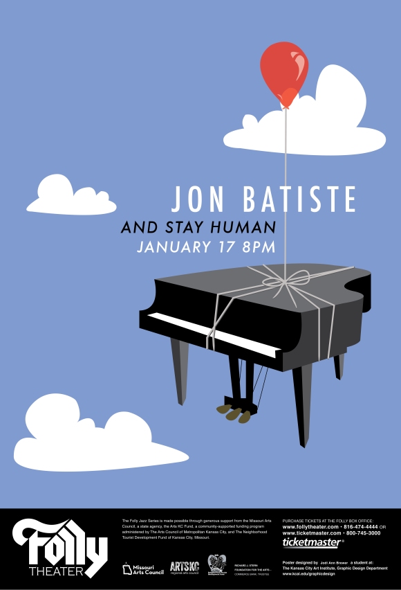
with the help and suggestion of my oh-so-lovely studio mates, i have nit-picked, spicked and spanned up my design. and i’ve tried to step back and see if there is some…something that i am missing (since i’m so zoomed in and all) to really make it sparkle and shine. if you see things that i don’t, tell me. this is what i have:

roughs-02


batiste in process

so here are images of the process I have on my three different poster directions for batiste. potential?


pretty colors make people drool.

i used a lot of purples which instills confidence (royalty) and spiritual connection. these two attributes speak well to batiste as a person and his music.

i offset the cool colors with pops of red for some attention grabbing, excitement, and passion all of which are also very present in his music.

with the neutral earthy colors I wanted to convey a sense of duality between preservation and creation.


I chose futura as the typeface for batiste because he’s up with the times, hip, and clean cut stylish.

jon batiste and stay human for the win

so here are some of my initial thoughts and sketches for my jon batiste folly poster design.  he’s a super fun guy with an amazing musical talent – and he’s pretty stylish which never hurts.

just in case you can’t read my scribbles of handwriting, these are a few thoughts from batiste himself that I kept in mind while sketching:

vibration of uplifting people though music.

create an experience rather than preserve.

spread love and please god.

destroy stereotypes.

we all share the same humanity.