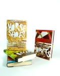
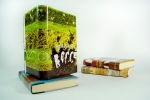
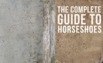
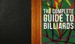
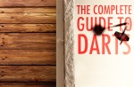
here are my final book jacket designs for my oh so lovable sports series. for these designs I was still focusing on the environment and textures of the sports (wrapped around) and residue left behind from impact (integrated with my hand cut type), except this time I did it a bit better than before. with these I delved more into experimentation with layering and analog which helped a lot in my opinion.
The Brewery
Where Ideas Are Brewed
Category Archives: VisCom


Get to know the Bronte Sisters
Charlotte, Emily, and Anne make up the Bronte Sisters. Though three separate people, they all shared the same qualities, attributes, mindset, and life.
Three sisters in a family of seven during the early 1800s. After their mother died of disease when the girls were still young, it was only down hill from there– these three would go on to endure existence’s that were tragic and short-lived. As their family members died off one by one to some disease or another, the sisters found solace in the moors and picked up the hobby of writing. All three wrote novels and collections of poetry, both in collaboration with each other and on their own, and inadvertently their writing styles became indiscernible from one to the other. They used the alias’s Currer, Ellis, and Acton Bell because the time period called for them to take on masculine names in order to be published. Today they are most well known for their novels, Wuthering Heights and Jane Eyre.
Though all three Bronte sister’s were romantics and often wrote tales of tragic love, none of them had a love life of their own. Through their writing, they channeled the tragedy of their lives into beautiful and poetic works that live on today. The Bronte sisters were melancholy and eery but as portrayed through their work, always maintained a beautiful sense of hope and love.
And then they all died of tuberculosis.
and this is the only known photograph of them. ever. enjoy. 
me, myself, and the course; a self-assessment
I feel like through the extent of this course I have learned to push myself and my work and to not be afraid to try new directions. Though I have been known to come down with spells of “The Brewer Disease” where I struggle with the conceptual side of things. For example with my train poster, my conceptual ideas and inspiration were very weak at first and not showing through in my design. But I feel as if I pushed myself to try many different directions and at times, step back and revaluate my thought process before diving back in. So, all in all I feel like I still have plenty to improve on, especially in my thought process and nailing down some solid concepts. Then there is keeping up with my process blog…which, I will admit right here and now, that is not my strong suit. But now we must arrive at my weakest link of all- participation in class crit. In any sort of formal conversation I get all blushy and flustered and nervous and really really close-mouthed. This is something that I have been trying to improve on my whole life and something that I will continue to put effort towards.
mock up
this is my first stab at conceptual mockup for my book covers. thinking about the environment or textures that my sports exist around. and trying to convey impact and residue of the actions. and as i said, they’re for book covers. so think of it in terms of back/spine/cover.

color me sporty
my four sport activities for my book jacket series:
darts, billiards, horseshoes, bocce
For this I am making a series of “The Complete Guide to:…” book jacket designs that display the essence of these sports without literal iconic imagery.
My initial idea is to physically paint the titles on different materials that relate to the sport (corkboard=darts/grass=bocce/green felt=billiards/sand=horseshoes) and then use the sport equipment against that and photograph the residue. since my sport series are about targets and impact I wanted to capture the imprint of the sports.
My second idea focused on the precision of these target sports. having a zoomed in image of of the sport object at the desired destination point but super zoom to show something beyond the target point. example being dart in the center target point but zoomed in to see it darted into a small insect.
My third concept focuses on the idea of the “complete” guide. In which i would construct different objects out of the sport equipment, such as the darts together to form a mass that looked like a bouquet of flowers (or something more relatable, but still seemingly out of place). This would be to imply that the sport is not all that it seems.
empire builder track to print
remember my two design directions before? well they came together and had a baby. and then that baby had plastic surgery. a lot. It doesn’t even look much like either of it’s parents anymore.
I made my inspiration, my reason for creation, a bit more clear through the quote “enough time to do all the nothing you want”. and simplified other information. i kept the watercolor texture and colors and incorporated that text behind image with the title behind the mountain. let me take you on a journey of all the no’s i went through to get to my yes:
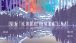


and then the final design:

empire builder poster
When designing my poster, I had conflicting ideas that went in two different directions. But in both of them I had a main focus on typography. One direction I went for a more abstract idea of colors throughout the duration of the trip whereas in the other I used actual images of main stops and landscape in-between.

Empire Builder
Project1: Choose an amtrak route and design a poster that explores qualitative and quantitative elements.
here are my rough ’em up design ideas for my train route poster. Find below jam pack full of start up inspiration and beginning concepts.
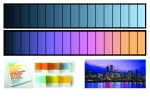
I am attempting to merge qualitative and quantitative design into a cohesive whole. One concept of mine is to incorporate color into the typography in accordance with the hues of the sky at the time of day when you pass each stop. Another concept involves inspiration from vintage travel postcards, incorporating image of scenery into the text. Then for a third, creating the text myself with watercolors to emphasize a more personal feel to the work. I would like to experiment with having the poster be heavy on the informational aspect but also a romantic feel within the text itself. But I will also experiment on more qualitative designs stemming from inspiration gained from vintage screen print posters.


record sleeve progress
dean martin is so dreamy.


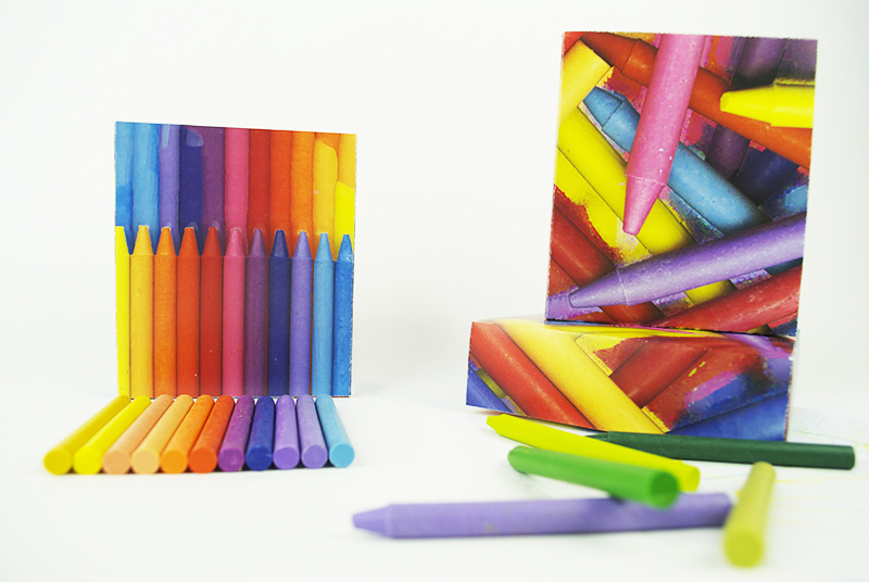
Crayon Final Images
and the winner is…..