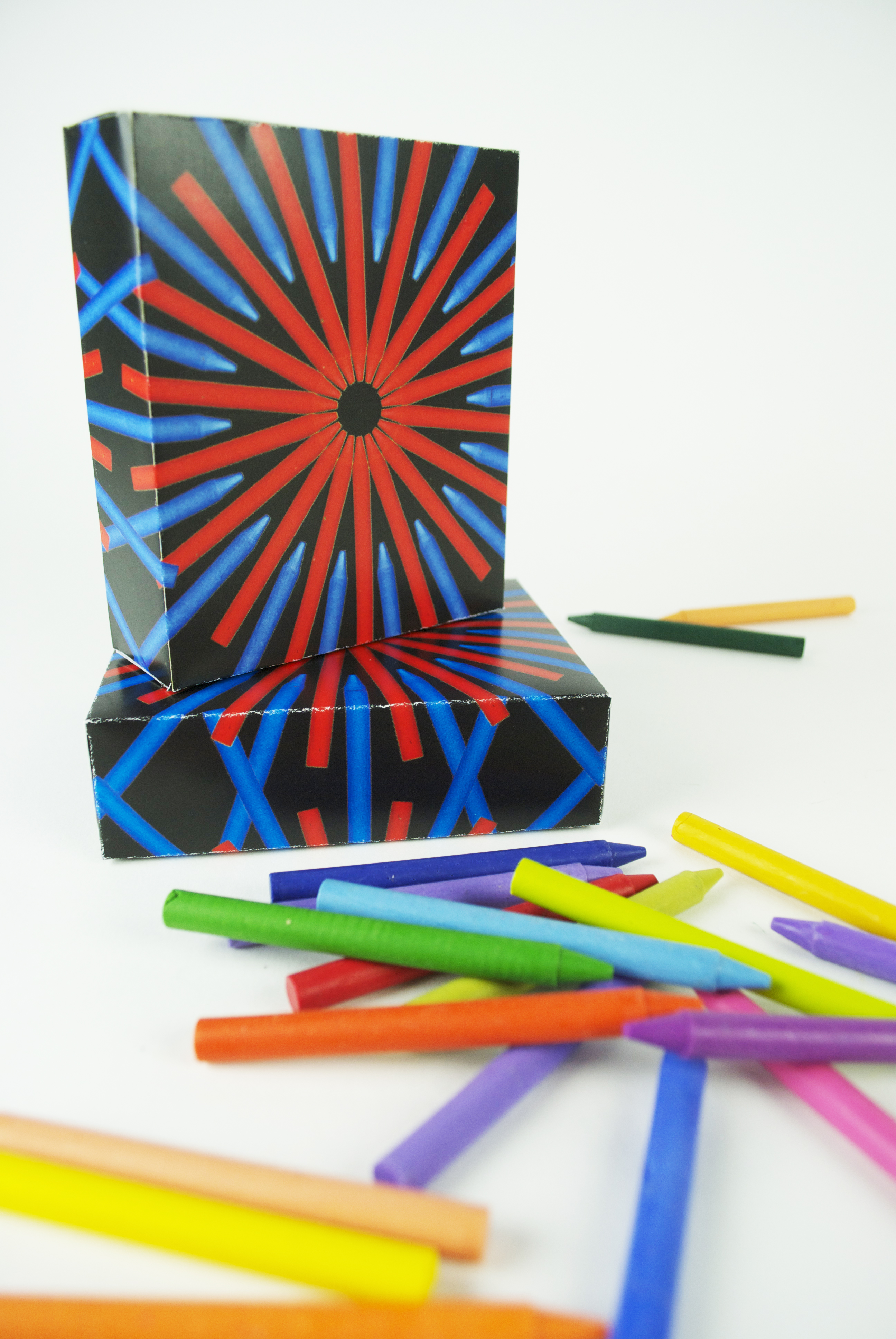
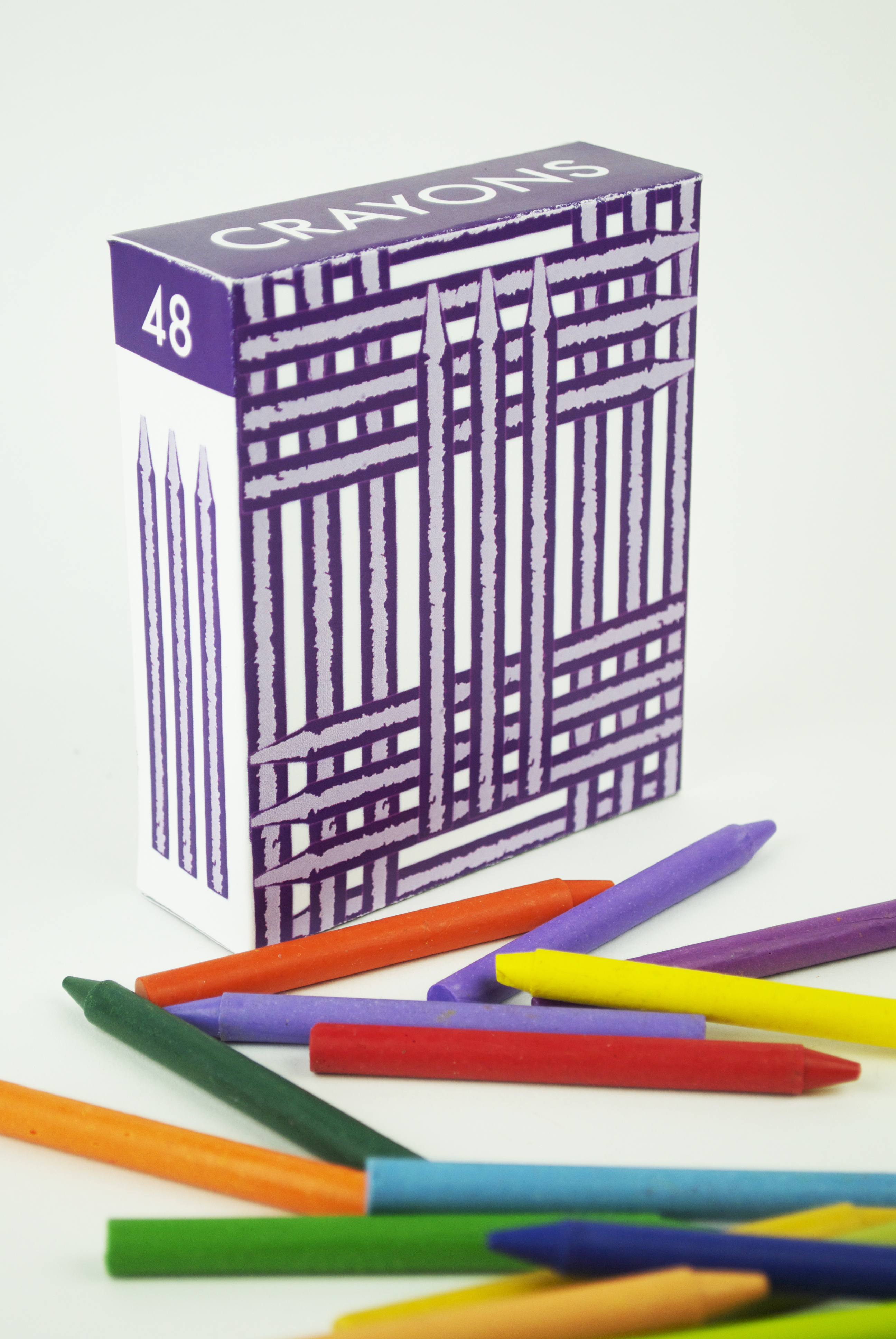
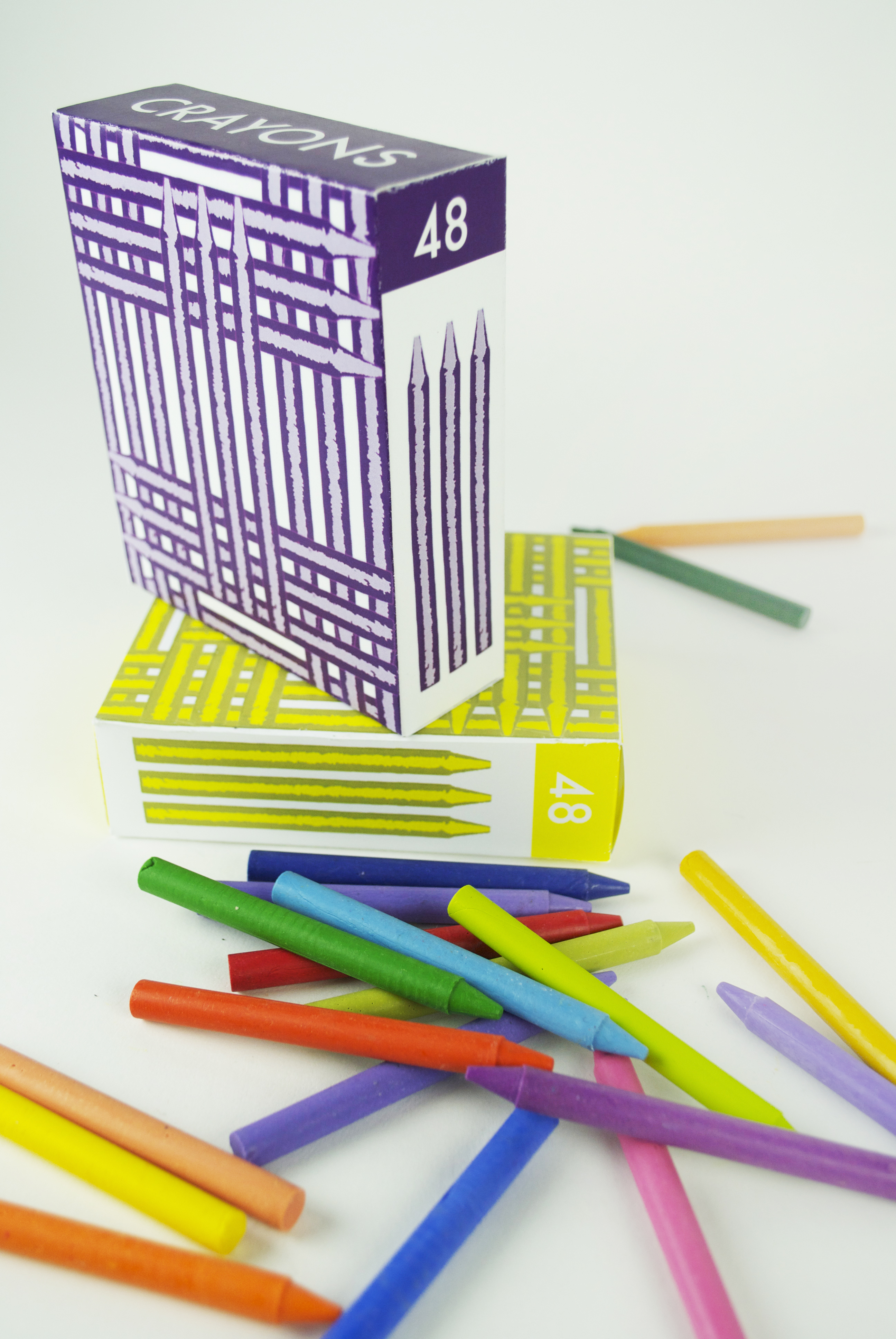
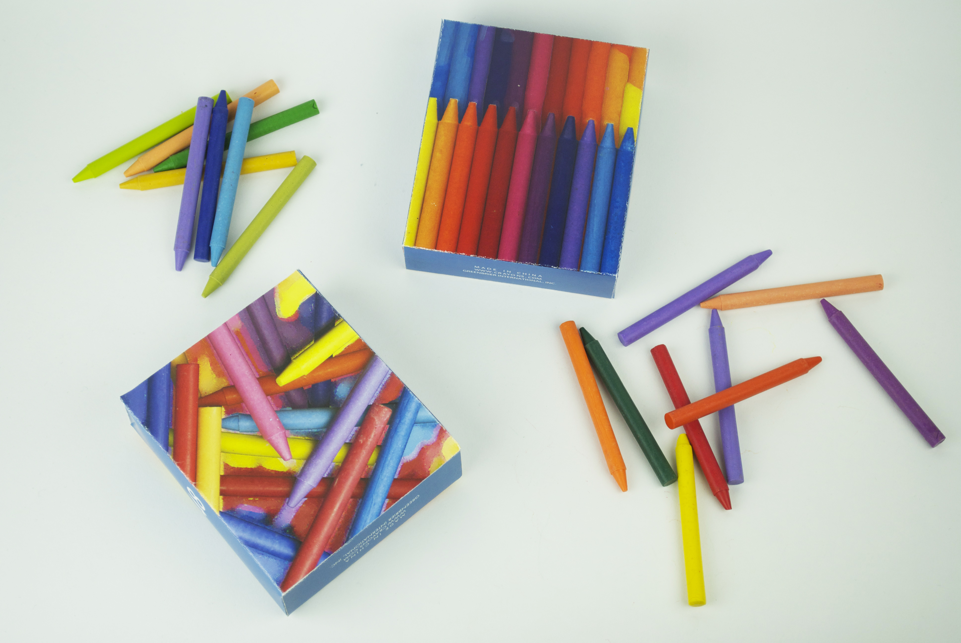
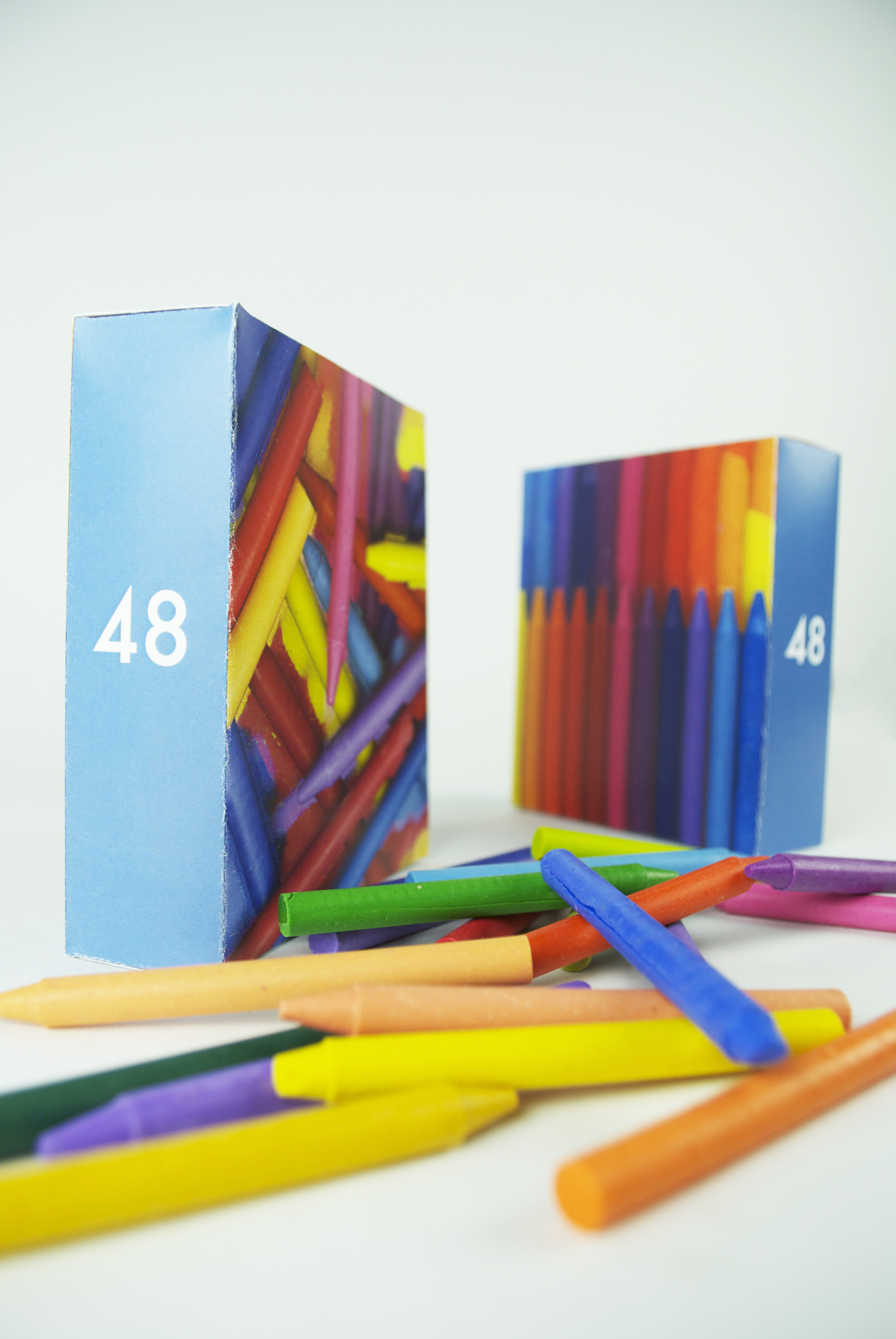
here are some photographs of my crayon box designs. i have been trying to convey joy and pleasure and other enjoyable emotions of that sort. my imaginary audience is all the children of the world and so i attempt to appeal to them through bright colors and sunshine. though some of the designs begin to be more structured as i appeal to community and togetherness.
The Brewery
Where Ideas Are Brewed
Monthly Archives: October 2012


in class assignment finalists
these are the chosen five out of my twenty hierarchy exercises in which I explored different options and combinations of leading, indent, weight/style, and scale.


Book Cover Designs
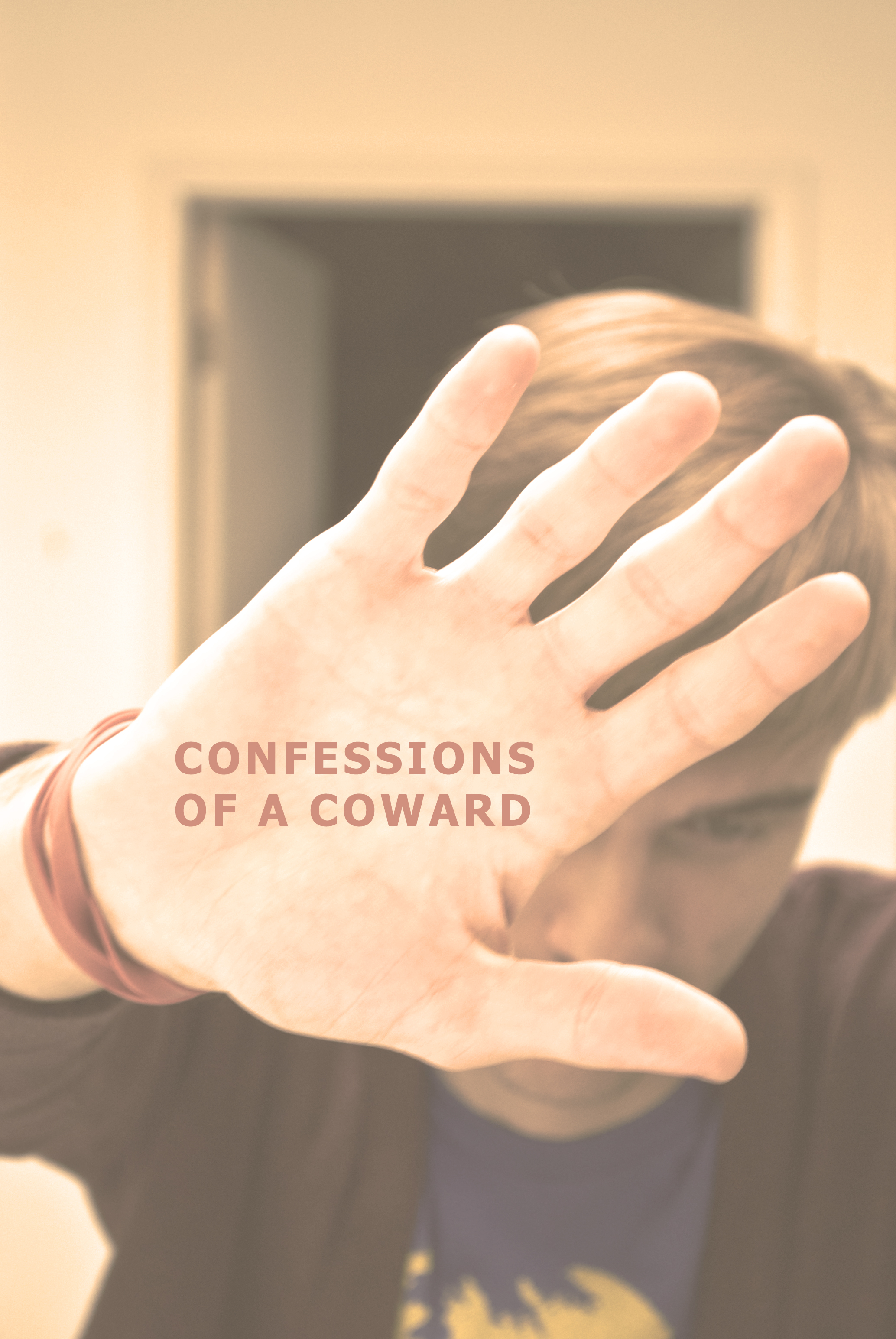
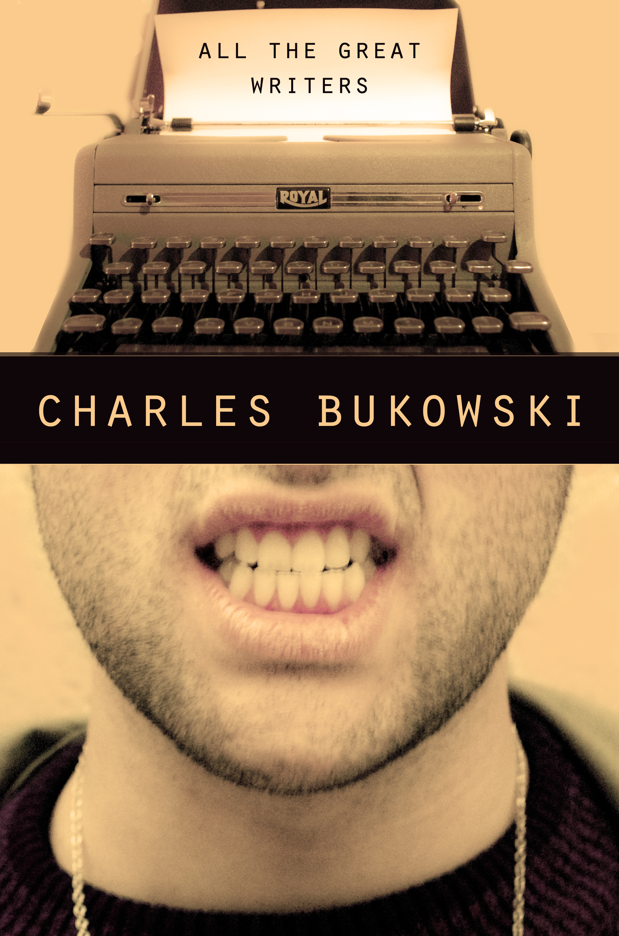
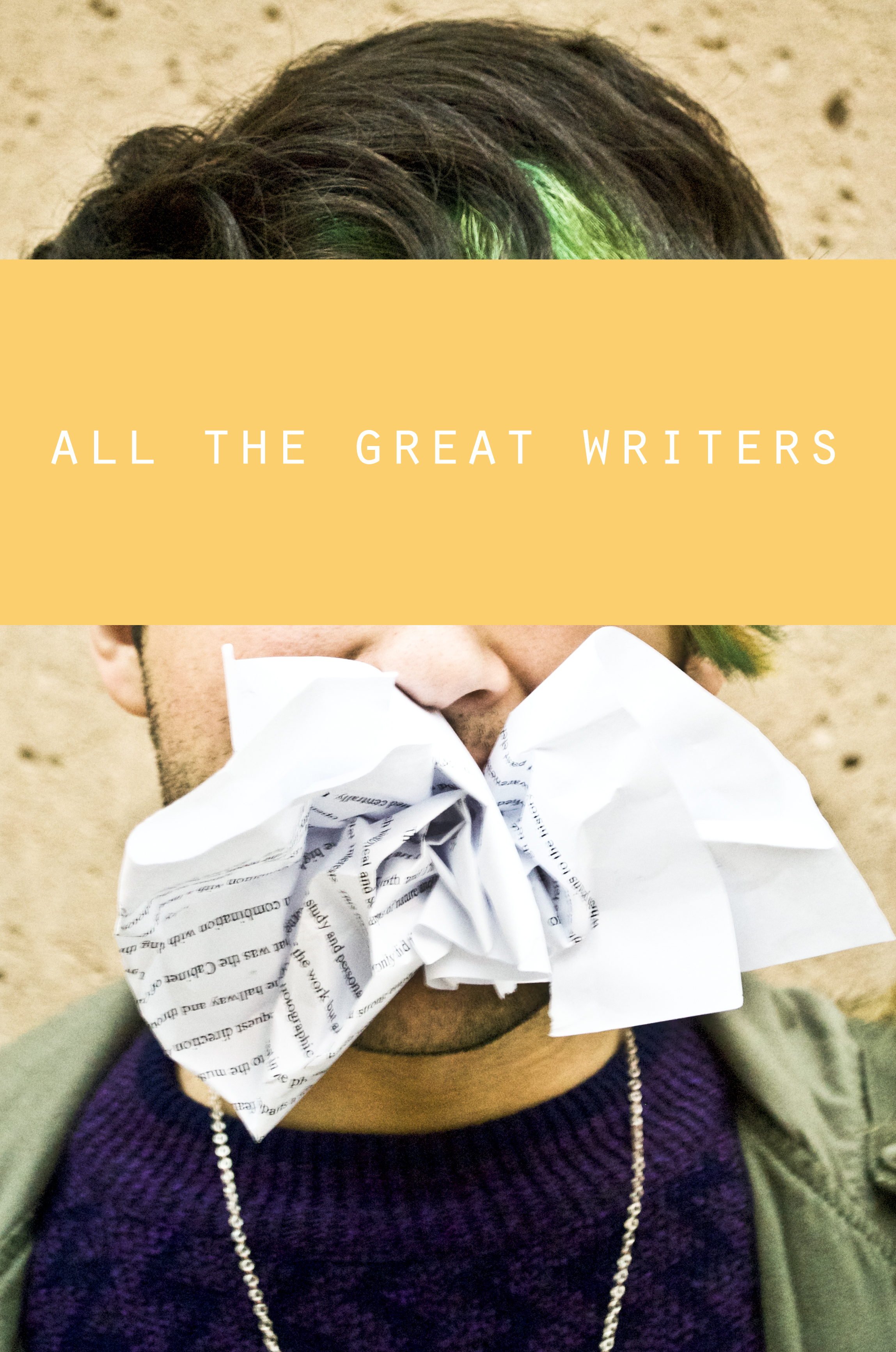
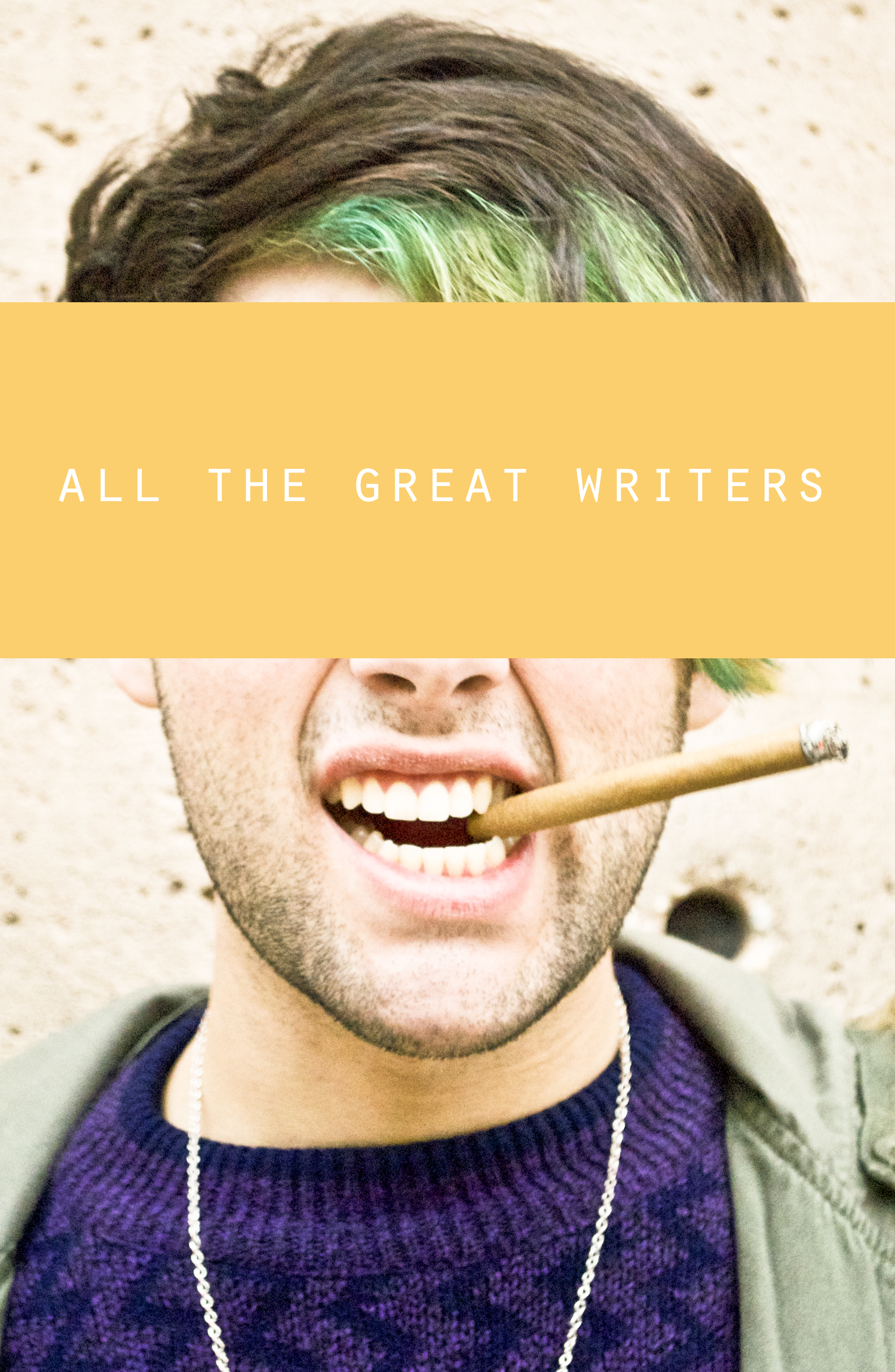
Charles Bukowski’s writing is always just so raw and real with his characters, so I wanted all of my covers to be portrait type depictions in a way. But I also wanted to keep specific identity skewed. So I played around with text, blocks of color, clarity, and steamy mirrors to cover up the faces in my pictures.
there were three options for each story depicting three themes found within.
The Most Beautiful Woman in the World/ Confessions of a Coward/ All the Great Writers——in that order:


Typographic Metaphor
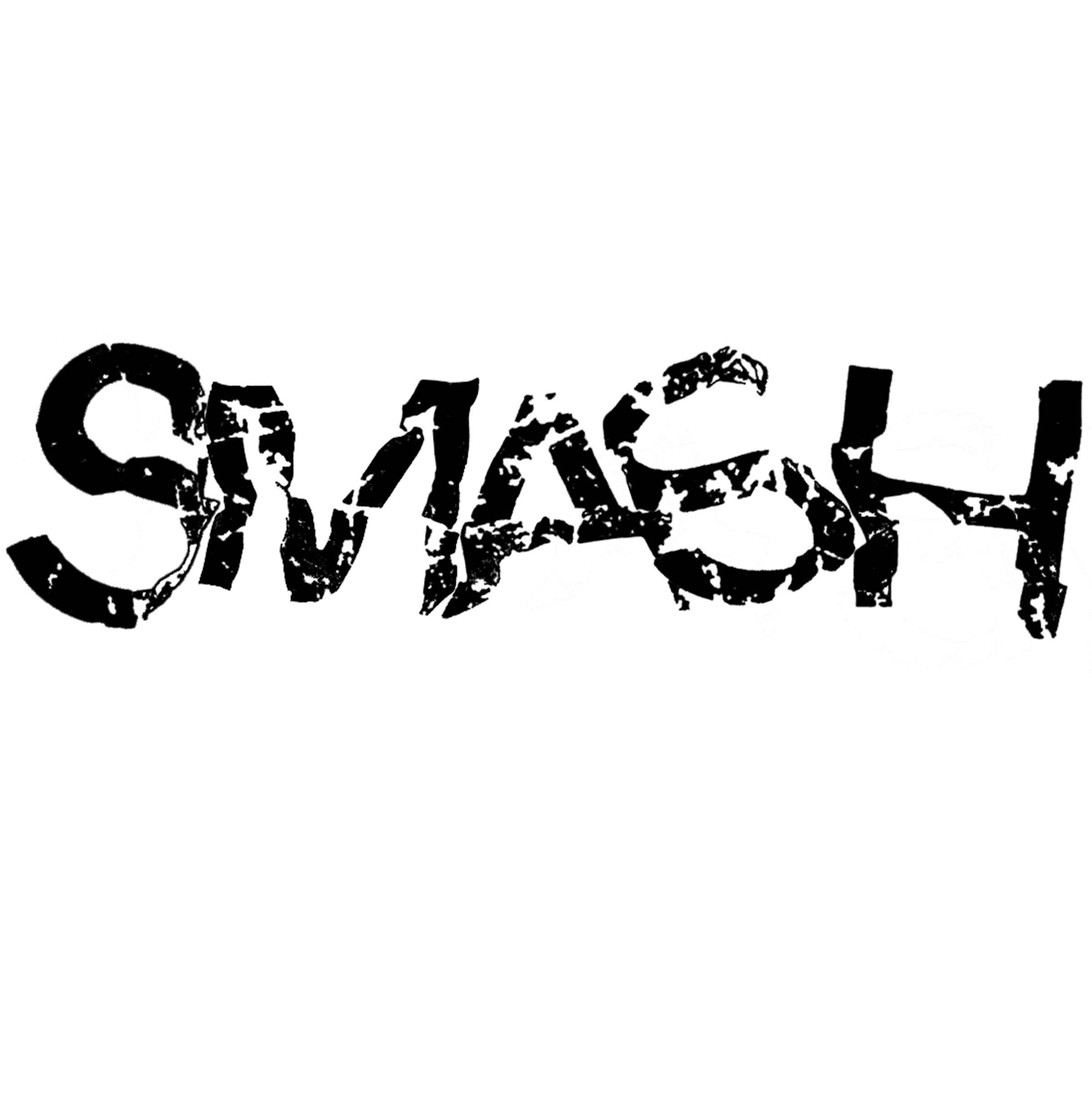
For the metaphor assignment, I chose six words that I would be able to typographically explore and exaggerate. Those six words were: follow, constrict, panic, smash, subtle, and escalate. I then promptly proceeded with thumbnail sketches for possible ideas. I attempted to portray the meaning of the word using only the word itself.


I then took the better of the thumbnail ideas into illustrator for my finals. I chose to use the typeface grotesque because I felt that the san-serif style lacking any embellishments better fit my words which are not especially elegant or graceful. The words I chose for my final three were smash, constrict, and subtle. for constrict and subtle I played around with tracking, kerning, and size to convey the meaning of the word. ‘Subtle’ is smaller and tracked out along the page while for ‘constrict’ I changed the kerning between each letter so that they would overlap and…well, become constricted. For the word ‘smash’, I printed off the word unaltered, crumpled up the page, scanned it back on to the computer, and cleaned it up a bit. I had some do-overs with that one. But this is how they all turned out:


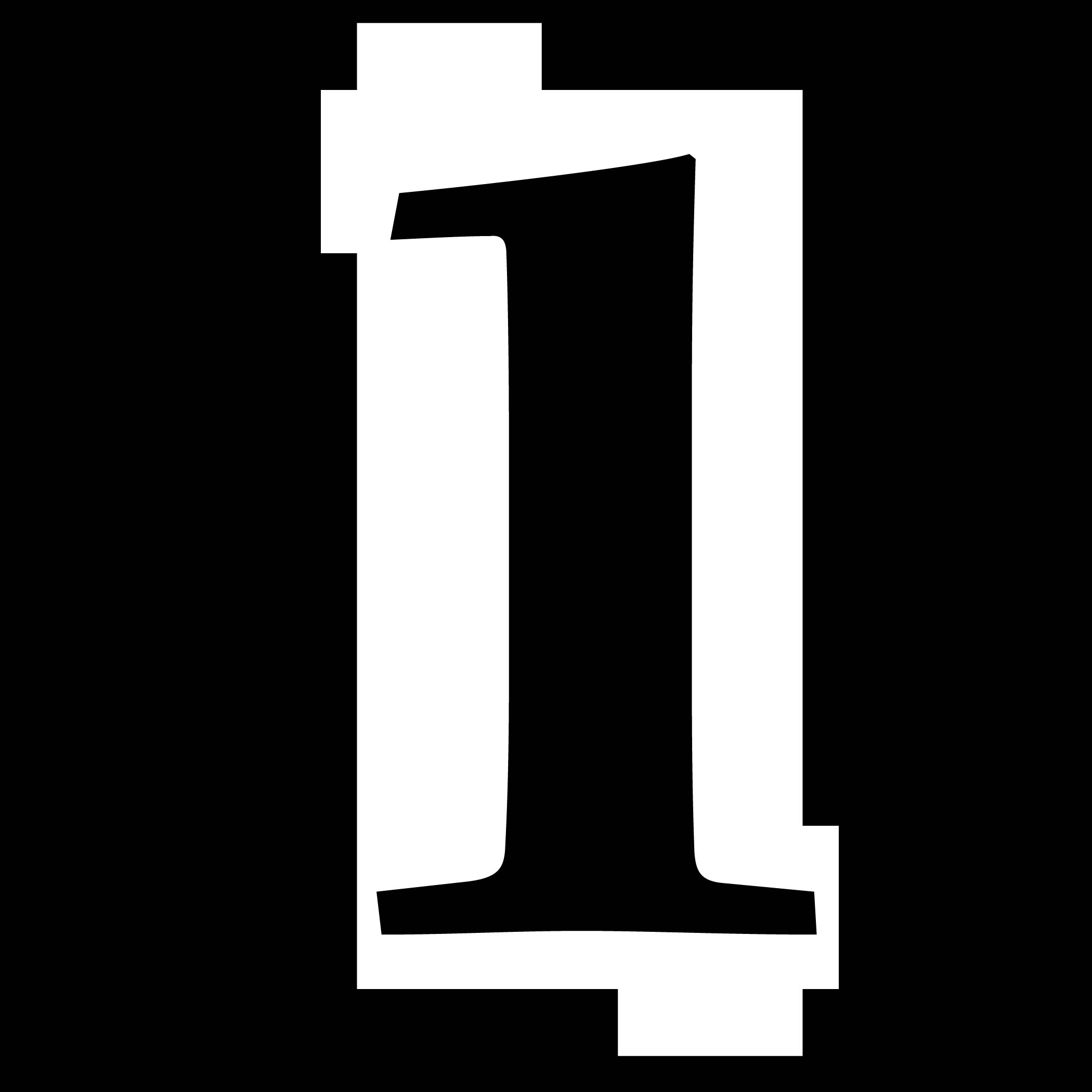
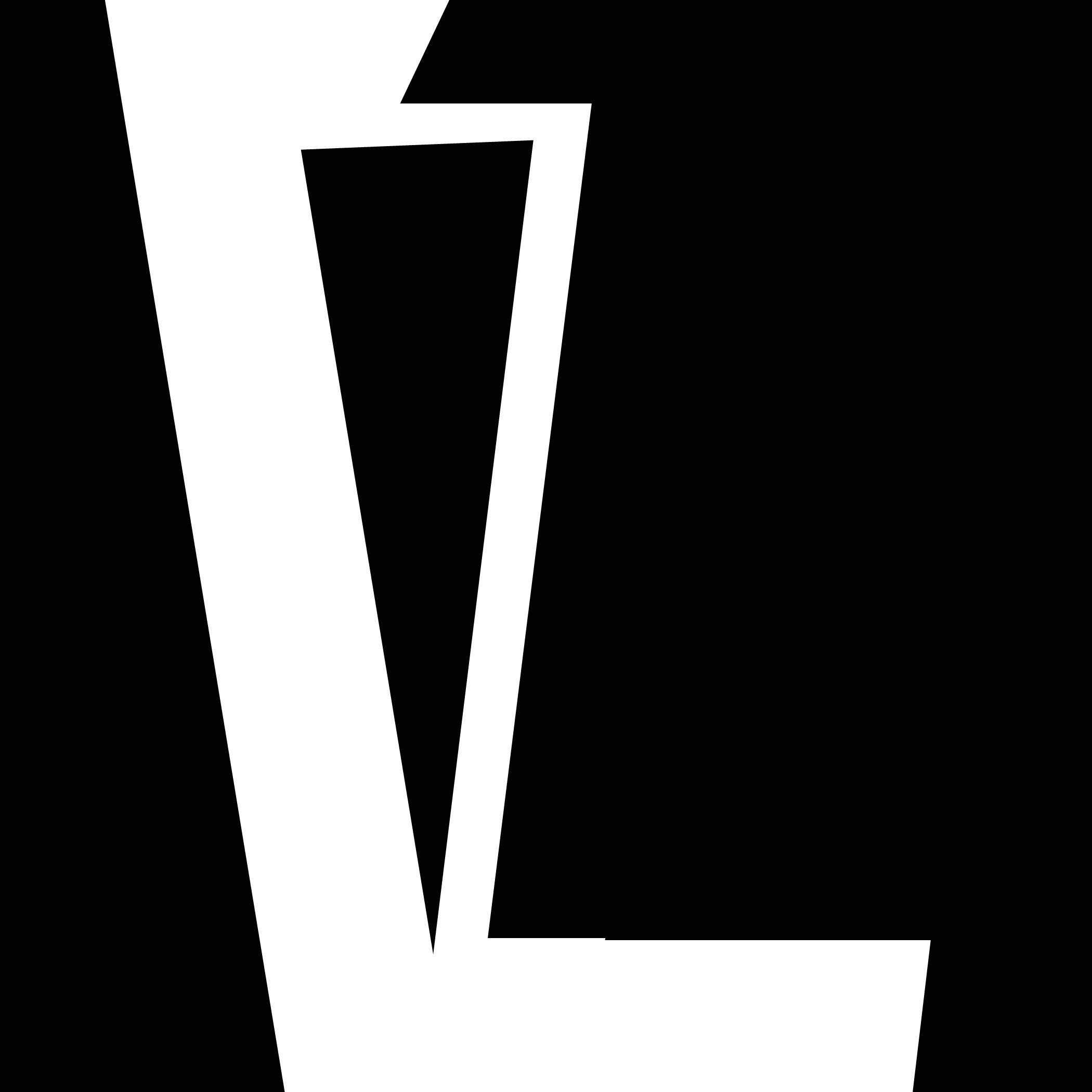
Letterpress Project
My partner, Bri, and I had a grand ol’ time working on the letterpress. Let me tell you about it.
First, there were our digital mockups in the computer to figure out our design layouts before we jumped into the letterpress. We decided to go with white on black to bring some irony to the quote about color. And we felt the making both of our designs in a vertical justified column brought a cohesive element to the set.


Firstly in the world of letterpress, on our hunt for the correct letters in the 34 pt. Alternate Gothic typeface, we ended up reorganizing the whole drawer of type in desperate search for just one more ‘E’. Which we did find and there was much joy and celebration. We were then able to set our designs. It was a great big puzzle to get the correct tracking between all the letters to justify the type into a nice rectangle. It took some time, but we got it down.


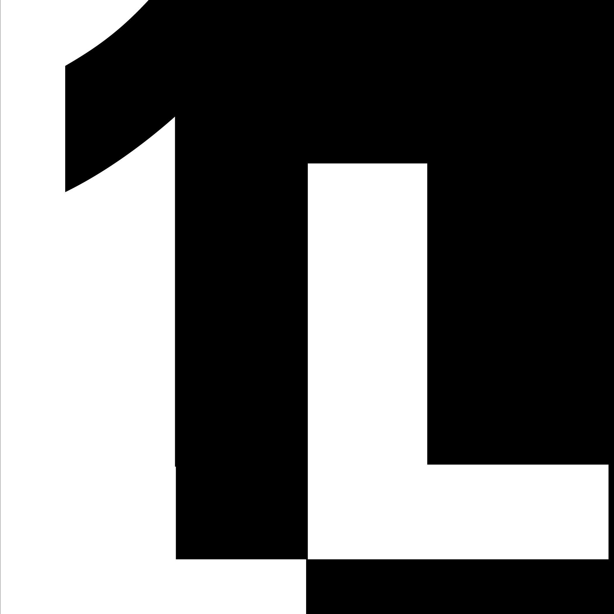
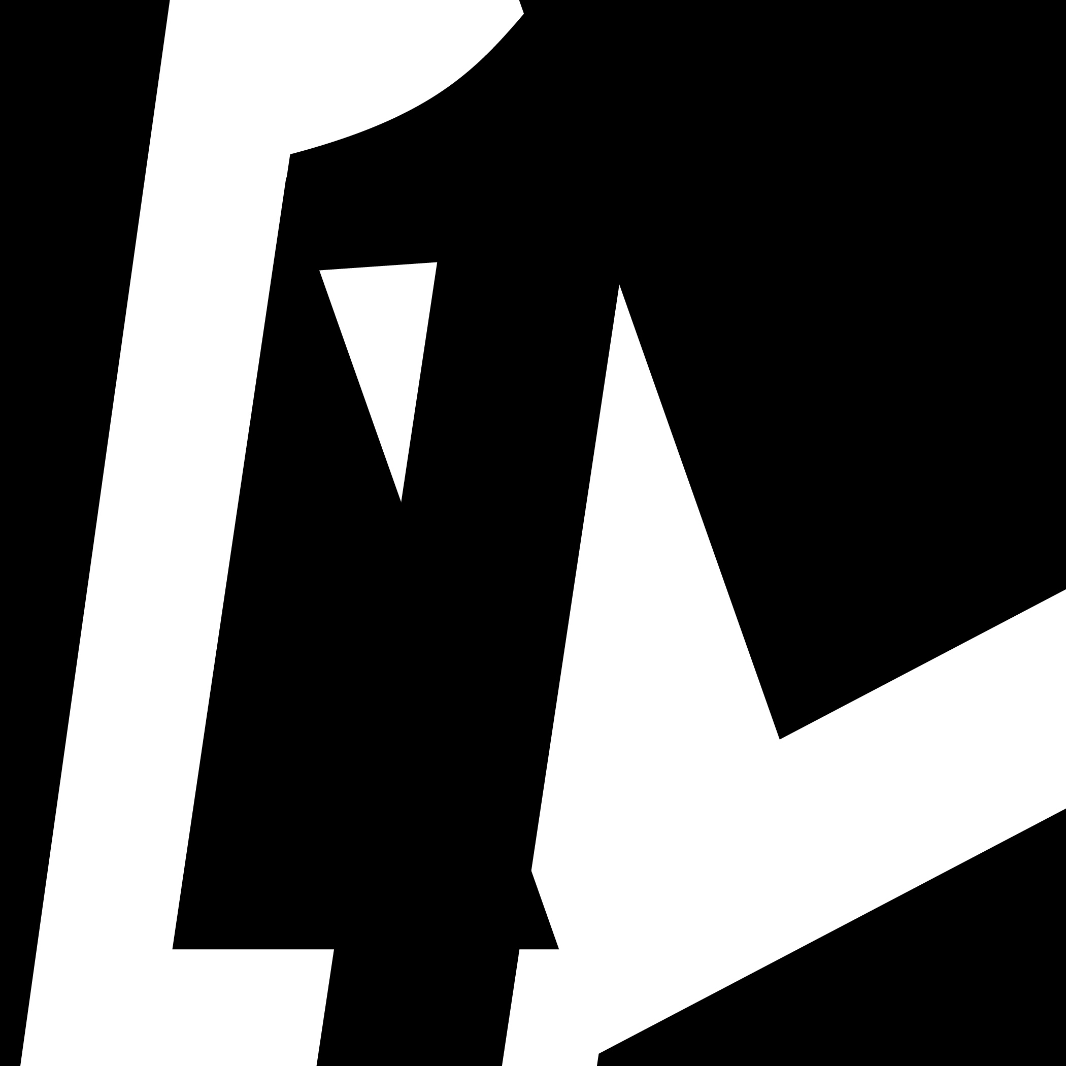
Then, with the printing process, we were using combination of wood and metal type and white ink on black paper, making it difficult to achieve an even ink consistency throughout all the letters.

So we had to experiment with amounts of ink, layering up tape in certain areas under the paper to get different pressure, and using the different printing presses. and this is what we got.
 For our experimental cards, we played around with using colored ink. At first we tried the colored ink on black paper but it wasn’t showing up very well, so we ended up printing with the colored ink on white paper which gave them a nice pop.

Charles Bukowski

Charles Bukowski doesn’t sweeten things up or romanticize the lives he writes about. He is a vulgar and gritty man, but if anything, this style of writing just makes his stories seem all the more real.
Short story one: “All The Great Writers”
Themes: expectations/manliness/fame/insanity
Ideas to Illustrate: It definitely should incorporate a cigar, there are multiple references to cigars in the story.
Short story two: “Confessions of a Coward”
Themes: identity/self-evaluation/cowardice/denial
Ideas: I was thinking taking pictures of multiple different peoples faces and piecing them all together. Either that, or a frog, if i can find a frog.
Short story three: “The Most Beautiful Woman in Town”
Themes: assumptions/powerlessness/manipulation/regret
Ideas: A portrait of a girl with hands reaching at her from all around. So really it would be more hands than any face.
Client Progress
My client is Lauren Lanigan. She is a first born. Words she uses to describe herself are perfectionist, confident, motivated, competitive, and systematic.
here are some rough ideas…