Monthly Archives: February 2013

color me sporty

my four sport activities for my book jacket series:

darts, billiards, horseshoes, bocce

For this I am making a series of “The Complete Guide to:…” book jacket designs that display the essence of these sports without literal iconic imagery.

My initial idea is to physically paint the titles on different materials that relate to the sport (corkboard=darts/grass=bocce/green felt=billiards/sand=horseshoes) and then use the sport equipment against that and photograph the residue. since my sport series are about targets and impact I wanted to capture the imprint of the sports.

My second idea focused on the precision of these target sports. having a zoomed in image of of the sport object at the desired destination point but super zoom to show something beyond the target point. example being dart in the center target point but zoomed in to see it darted into a small insect.

My third concept focuses on the idea of the “complete” guide. In which i would construct different objects out of the sport equipment, such as the darts together to form a mass that looked like a bouquet of flowers (or something more relatable, but still seemingly out of place). This would be to imply that the sport is not all that it seems.

empire builder track to print

remember my two design directions before? well they came together and had a baby. and then that baby had plastic surgery. a lot. It doesn’t even look much like either of it’s parents anymore.

I made my inspiration, my reason for creation, a bit more clear through the quote “enough time to do all the nothing you want”. and simplified other information. i kept the watercolor texture and colors and incorporated that text behind image with the title behind the mountain. let me take you on a journey of all the no’s i went through to get to my yes:

and then the final design:

baby steps

here is my first exploration into kinetic type using grow, fade, move, rotation, and freestyle. enjoy:


empire builder poster

When designing my poster, I had conflicting ideas that went in two different directions. But in both of them I had a main focus on typography. One direction I went for a more abstract idea of colors throughout the duration of the trip whereas in the other I used actual images of main stops and landscape in-between.
anchor and relay

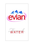
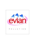
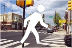
here are some studies of anchorage and relay. where the anchor in the form of text or image reinforces the subject and a relay (text or image) will give more information about the subject that is not clearly seen. My two subjects were the evian logo and mr. walk signal there. enjoy.

window application

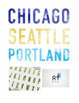
here are my previous designs modified to fit a certain window on the building. and now i’ve add color! and though the colors are overly bright right now and slightly hard to look at, i am still playing around with those.

Empire Builder

Project1: Choose an amtrak route and design a poster that explores qualitative and quantitative elements.

here are my rough ’em up design ideas for my train route poster. Find below jam pack full of start up inspiration and beginning concepts.

I am attempting to merge qualitative and quantitative design into a cohesive whole. One concept of mine is to incorporate color into the typography in accordance with the hues of the sky at the time of day when you pass each stop. Another concept involves inspiration from vintage travel postcards, incorporating image of scenery into the text. Then for a third, creating the text myself with watercolors to emphasize a more personal feel to the work. I would like to experiment with having the poster be heavy on the informational aspect but also a romantic feel within the text itself. But I will also experiment on more qualitative designs stemming from inspiration gained from vintage screen print posters.

the eye of the beholder

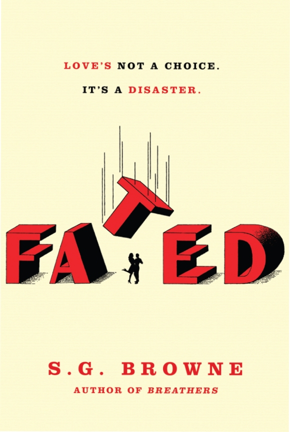
For my five iterations on connotation, I chose a book cover: Fated by S. G. Browne. It is a horrible book, don’t read it. But I bought it for the cover and it ended up coming in handy after all. Here’s the original cover:


original


I then made these iterations with these words in mind: handwritten, friendly, ironic, scary, and retro.

Enjoy:

Semiotics

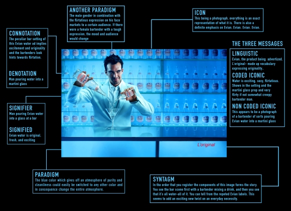
Here is my labeled Evian ad. Paying attention to denotation, connotation, icons, paradigms, and such.

1310691257287644

seven principle compositions: reloaded

here are my reloaded and revised compositions displaying the seven principles: gradation, concentration, space, direction, anomaly, texture, and repetition. I tried to keep in mind not only the principle but also the composition on the page, and the quote we are trying to represent. I completely redid some of them and for others I revised and rearranged certain aspects.