this is a first run at it. this is progress. it all gets better from here.
The Brewery
Where Ideas Are Brewed

Monthly Archives: September 2013
stein vs. stein
my overlying concept for both narrative and type is the idea of memories and how they fade over time. stein creates intimate detailed moments within her poetry and the act of writing them down is an act of trying to capture a moment in time. as i try to visually bring her words to life in these projects, i emphasize the fragility of memories over the passage of time.
here are my story boards for my two motion pieces:
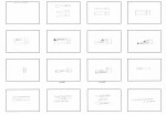

and a few motion tests:
and the cover of my book and an excerpt:


stein vs. motion
here are a few more process explorations. one more playing with cigarettes (don’t try this at home, kids) and the other is trying out aftereffects. still utilizing the concept of the fragility of memories and fading moments. I was thinking I could possible find a way to cohesively combine digital and analog methods of creating the type in the poems.
stein vs. vellum II
more progress on my selected stein poems. playing around with composition and emphasis. the core concept still being the passage of time and the fragility of memories.
eating:


a red hat:


folly poster [dun-dun-dun]
with the help and suggestion of my oh-so-lovely studio mates, i have nit-picked, spicked and spanned up my design. and i’ve tried to step back and see if there is some…something that i am missing (since i’m so zoomed in and all) to really make it sparkle and shine. if you see things that i don’t, tell me. this is what i have:
stein in motion
for my initial ideas about transitioning my selected stein poems into motion, i kept in mind my concept of the passage of time and the fragility and fleetingness of these singular detailed moments. that being said, i wanted to work with materials that were fragile and would change or could be manipulated over time. I thought of using materials such as candles and wax, ice, and cigarettes as seen in my mini-storyboards.

for my first two test motion pieces, i played with this idea of the loss of details over time through cigarette and candy letters. enjoy.
now is better
These are some low quality iphone videos of projected motion pieces from stefan sagmeister’s happy show. i took these a couple of weeks ago when i was in chicago, and have now discovered that they do not exist on the internet in a more flattering quality. i find them very inspiring for the projects ahead and design in general, so i share them with you. i continued to do research on these motion pieces, the happy show as a whole, and sagmeister himself (because he is so brilliantly wonderful). fun tidbit: the piece “now is better” was submitted to a design competition, and received first place but was then disqualified because it was deemed to be…not design. NOT DESIGN?! bah. sagmeister fought this verdict and claimed the award in end, and not for the first place position but for his work to be recognized as design.

both of these motion pieces are exploring idea’s of happiness (like two different poems by the same author? eh?). sagmeister spent ten years and traveled all around the globe in his research and design work focused on happiness. i wish i could do that for this project.
stein vs. vellum
as I started type experimentation with my stein poems, i really focused in on the intimacy of the moments in her words. the poems are so closely focused on one object, food, or room in that moment, as if a memory. I wanted to capture the feeling of detailed intimacy and the fragility of memory. I am experimenting with vellum to release the details of each poem slowly as you turn the pages, with the previous lines slowly fading away the farther you get into the book (like memories).


I also played with alternative ways of getting to that release of details and fading memories, through the deterioration of the text with water.
batiste in process
so here are images of the process I have on my three different poster directions for batiste. potential?


pretty colors make people drool.
i used a lot of purples which instills confidence (royalty) and spiritual connection. these two attributes speak well to batiste as a person and his music.
i offset the cool colors with pops of red for some attention grabbing, excitement, and passion all of which are also very present in his music.
with the neutral earthy colors I wanted to convey a sense of duality between preservation and creation.
I chose futura as the typeface for batiste because he’s up with the times, hip, and clean cut stylish.
