It’s that time of the year again. We have all been sufficiently fattened up and spoiled by the Christmas holiday’s and now we are back to school. And Project 1 welcomes us back with open arms. We are branding the design department with the inspiration of a quote by Albert Einstein- “Creativity is intelligence having fun”. and using principles of design including: repitition, texture, concentration, direction, gradation, space and anomaly.
The Brewery
Where Ideas Are Brewed

Category Archives: Typography1


Hey, It’s Clarendon Again
here are some more minor revisions to my Clarendon spreads. baby steps.


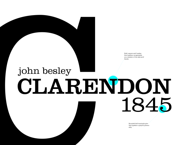
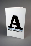
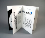
Clarendon Spreads
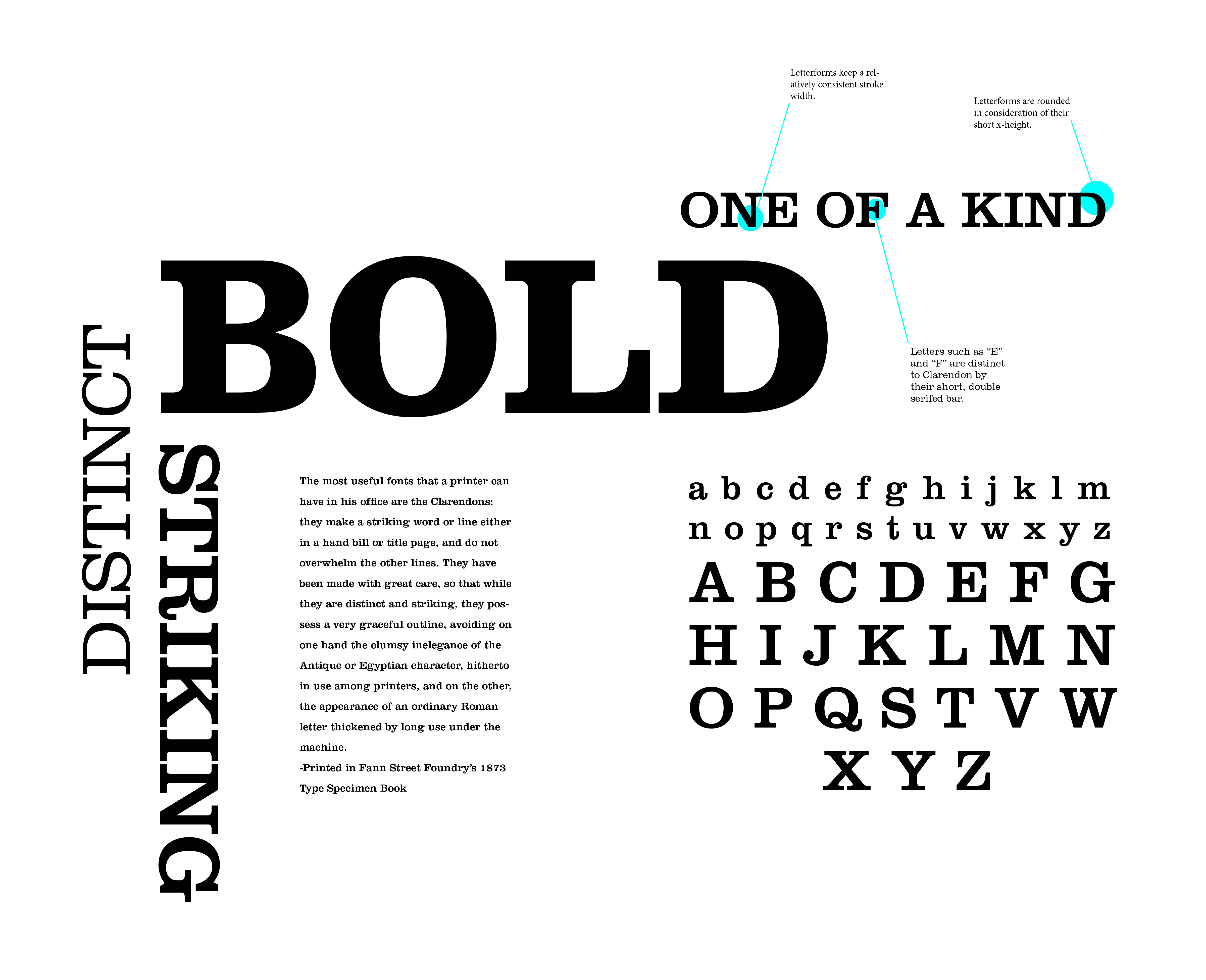
These are some spreads for my Clarendon typeface book for all you folks out there who want to know everything you could need to about good ol’ Clarendon. Once again with my spreads I am attempting to portray the bold and playful nature of Clarendon without being too overwhelming. Throughout my spreads I play around with dramatic scale change (bold) and orientation of type (playful).


Annotations
For annotating Clarendon typeface I attempted to carry over aspects of it’s type personality into the annotation style. I played around in bold and playful styles in my first round.


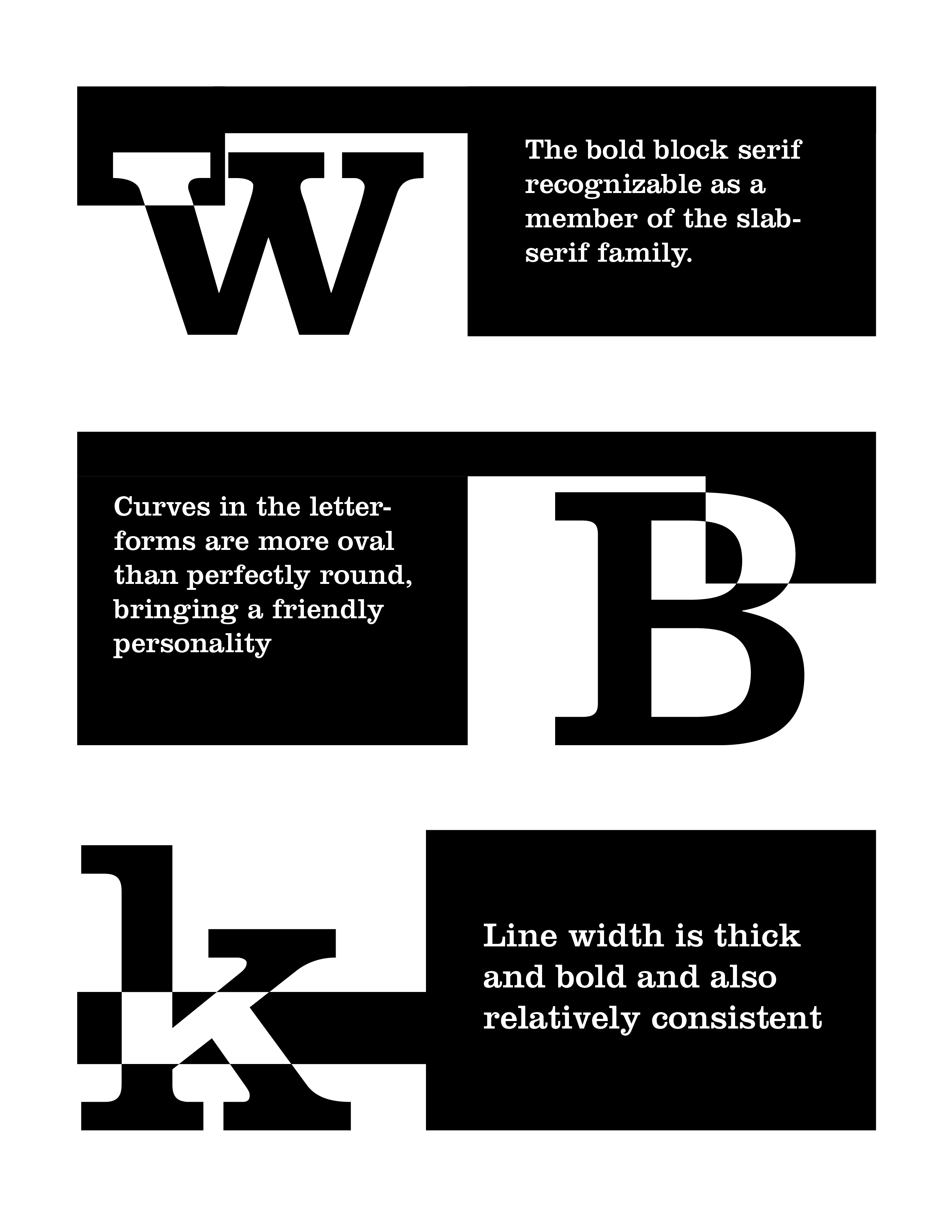

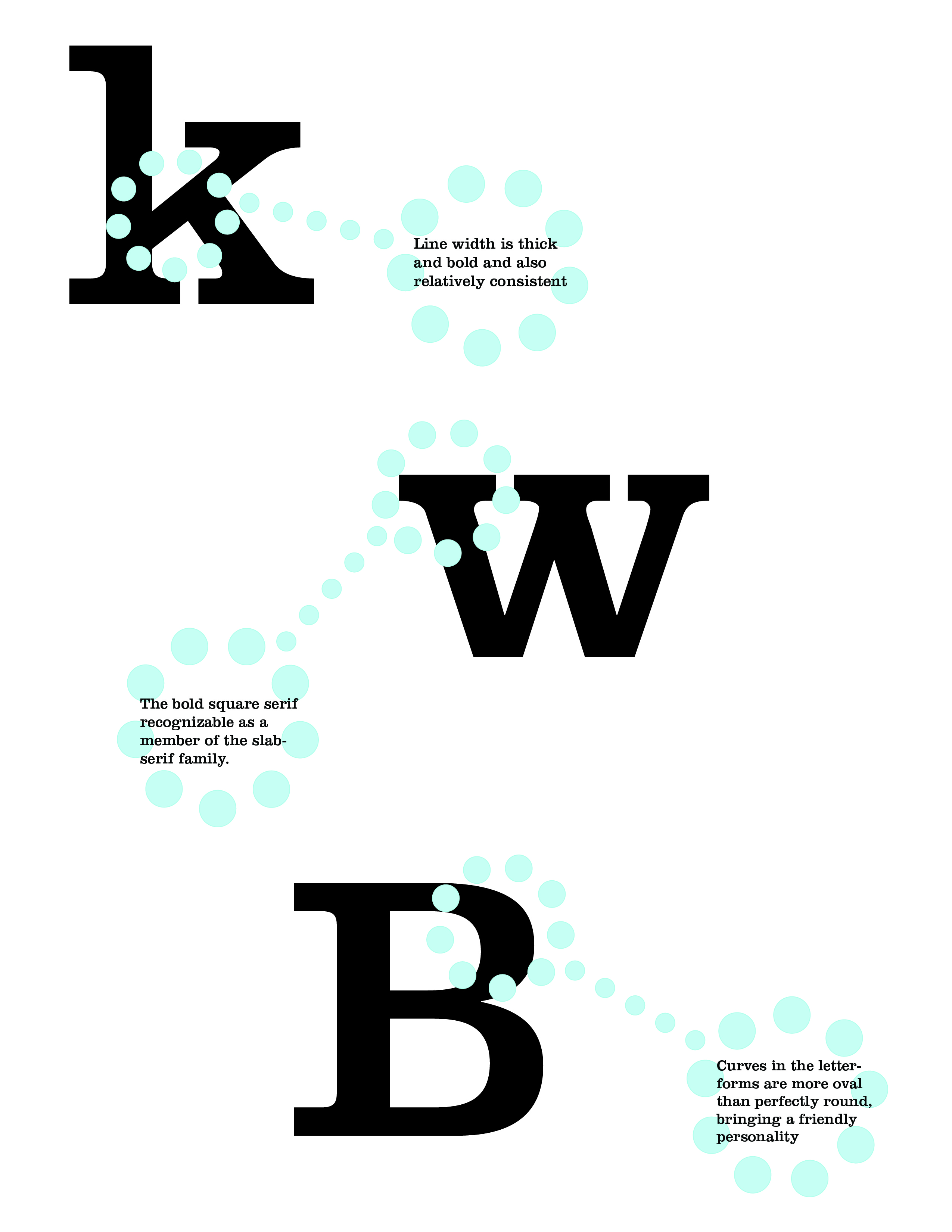
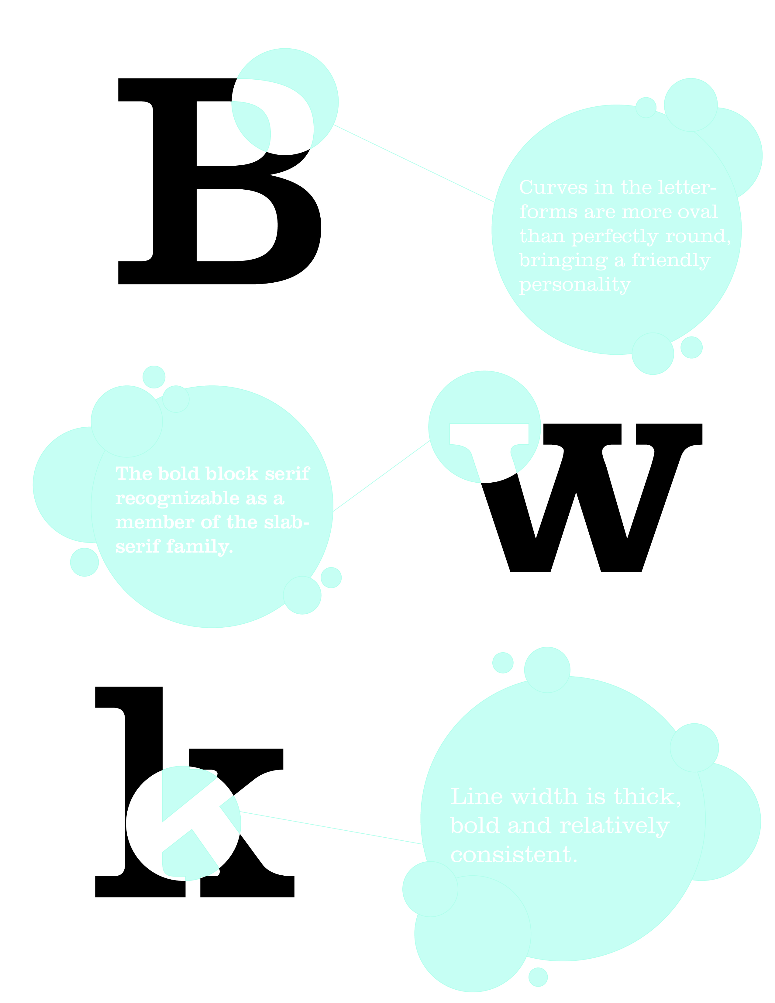
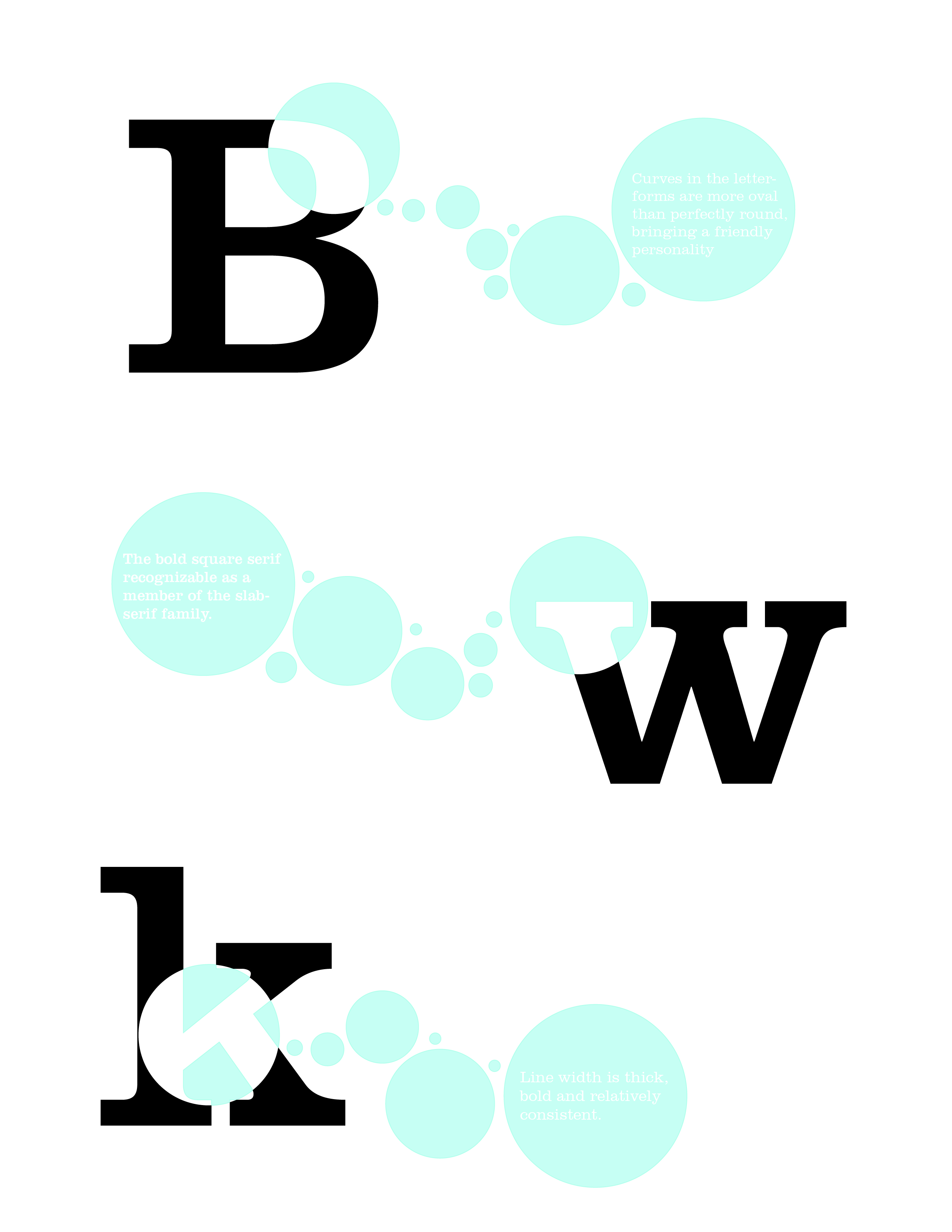
then, when revising them, I tried to move more towards playful but in a more subtle way as to not take emphasis away from the letterforms. though, the revisions still ended up needing some revising. think more subtle. They ended up looking a bit too much like soap bubbles.
a job well done
http://traceylynnfrye.blogspot.com
http://florentino-diaz.blogspot.com
hey everybody, these kids right here did a bang up job finding inspiration for their layouts. all for one and one for all. spread the word.
Miss Frye found an excellent example of a whole entire digital book on Universe. black and white, very classy, very useful. Mr. Diaz’s examples allude back to his first designs which is nice- shows direction.


the swiss typeface

“It’s like asking what you think about off-white paint”
I thought Mr. Spiekermann made a nice point in saying that Helvetica was good at the time but it has now just become default. That people are so familiar and accustomed to Helvetica, it’s everywhere and it’s never going away. “It’s air; you have to breathe, so you have to use helvetica.” Most people know of Helvetica if they think about it, but I, for one, never really noticed it being everywhere until this lovely movie pointed it out. It’s familiar, and comfortable. Some people like to stay in a familiar and comfortable little box. Then you have people like Spiekermann, who would rather break out of the box of comfort and conformity.
in class assignment finalists
these are the chosen five out of my twenty hierarchy exercises in which I explored different options and combinations of leading, indent, weight/style, and scale.


Typographic Metaphor
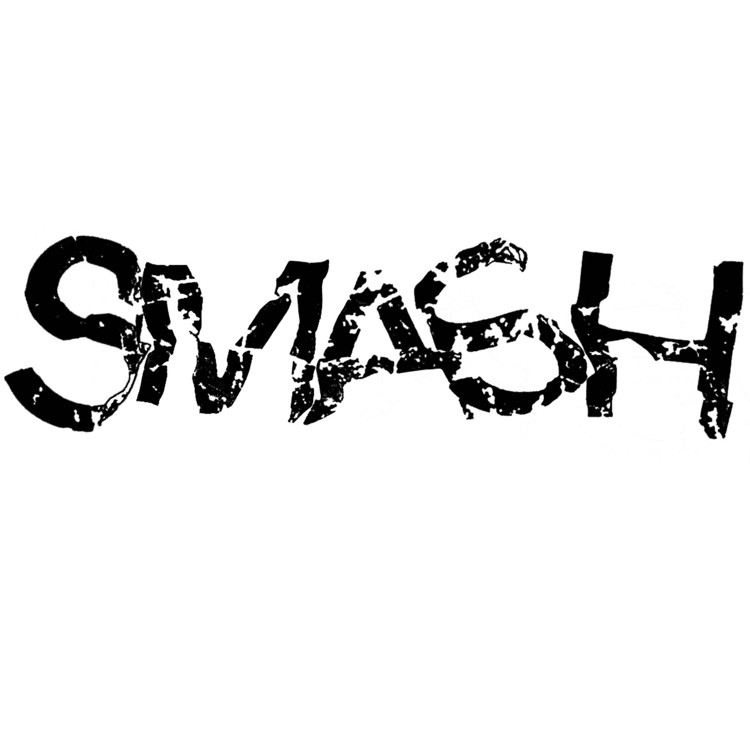
For the metaphor assignment, I chose six words that I would be able to typographically explore and exaggerate. Those six words were: follow, constrict, panic, smash, subtle, and escalate. I then promptly proceeded with thumbnail sketches for possible ideas. I attempted to portray the meaning of the word using only the word itself.


I then took the better of the thumbnail ideas into illustrator for my finals. I chose to use the typeface grotesque because I felt that the san-serif style lacking any embellishments better fit my words which are not especially elegant or graceful. The words I chose for my final three were smash, constrict, and subtle. for constrict and subtle I played around with tracking, kerning, and size to convey the meaning of the word. ‘Subtle’ is smaller and tracked out along the page while for ‘constrict’ I changed the kerning between each letter so that they would overlap and…well, become constricted. For the word ‘smash’, I printed off the word unaltered, crumpled up the page, scanned it back on to the computer, and cleaned it up a bit. I had some do-overs with that one. But this is how they all turned out: